Back to work

Building a free college application for students who need it most.

RoleLead Product Designer
CompanyScoir
Team1 designer, 4 engineers, 1 PM
PlatformsWeb · Mobile
User Research Stakeholder Interviews Journey Mapping Wireframing Prototyping Usability Testing Design Leadership Product Strategy Cross-functional Collaboration
Apply with Scoir

The Coalition for College Access partnered with Scoir to build a free college application for underserved students — people who couldn't afford application fees, didn't have an engaged counselor, and weren't well-served by Common App. We had eight months to go from nothing to a live product for the August 1 application cycle. The big design fight was about whether to build standalone or deeply integrated — I pushed for standalone, and the numbers backed it up. In year 1, 65% of applicants were brand new to Scoir. By year 2, over 150,000 students had submitted more than 500,000 applications to 181 colleges.

A partnership built to expand who gets to apply.

Scoir is a college and career discovery platform used by thousands of high schools. Most of the product is built around an existing relationship — counselors guiding students, schools connected to the platform. But a lot of students don't have that. No engaged counselor, no school on Scoir, no money for application fees.

The Coalition for College Access came to Scoir with a chance to reach exactly those students. If we could build the right product, we could give any student a free path to apply to colleges not on Common App — regardless of whether they'd ever heard of Scoir before. The deadline was August 1. We had eight months.

Research first, even on a tight timeline.

Eight months is tight, but not so tight that we could skip doing this properly. The students this was built for deserved better than a product built on assumptions.

Landscape research
Started by understanding what was already out there — Common App, Coalition App, state-specific options. What did students find hard? Where were the gaps nobody was filling? What did colleges actually need on their end to process these applications?
Journey mapping
Mapped the full end-to-end process: partner and college setup, student discovery, application completion, document submission, delivery to college. Multiple user types, multiple handoff points. Getting this on paper early caught a lot of complexity before it became a design problem.
Focus groups
Talked to students who'd recently applied to college through existing platforms. What was confusing? What felt unnecessary? Real application experience is different from what people imagine it will be — and we needed to know the difference.
Usability studies
Ran observed sessions and workshops with rising seniors testing early prototypes. Two distinct user types throughout: students connected to a Scoir school, and students coming in completely cold with no account.
Apply with Scoir student journey map

Student journey map — from first awareness through post-submission, across two user types

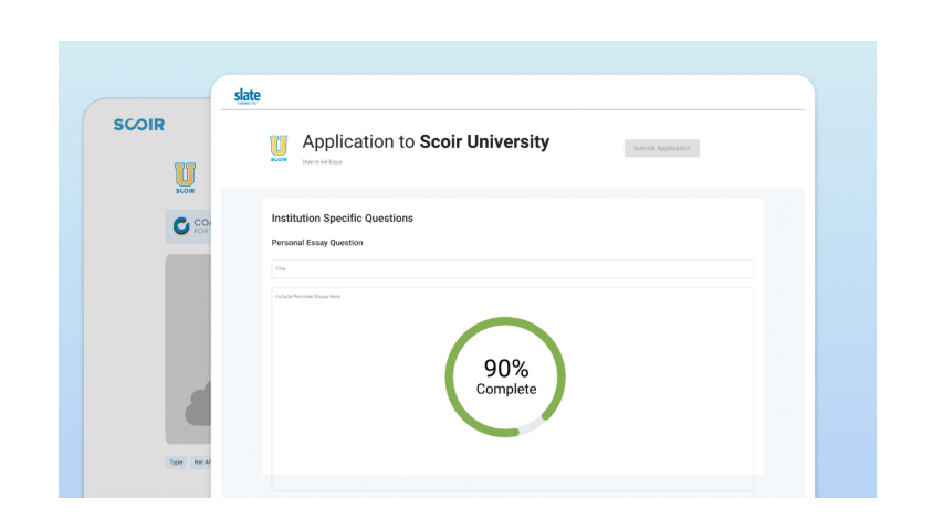
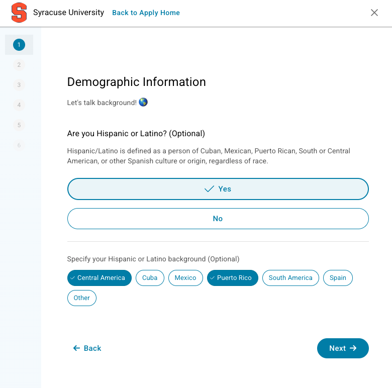
An application that felt like an application.

The most important early framing decision: this wasn't a feature inside Scoir. It was a standalone product that happened to live inside Scoir — and it needed to feel that way, especially for students arriving from a partner site who had never heard of Scoir before.

Apply with Scoir
Application form
Document upload
College selection
Application dashboard
Apply with Scoir animated walkthrough

Animated walkthrough — the full application experience end to end

For existing Scoir users, the application connected directly to their profile — their data carried over automatically so they could go from college discovery to applying without starting over. The mobile and broader platform views below show how Apply sits within the product for that user type.

Apply with Scoir on mobile
Apply within Scoir

Apply with Scoir on mobile and within the broader platform

The argument for standalone — and the compromise that worked.

I pushed for standalone. Leadership wanted deeply integrated.
Leadership wanted the application gated behind the full Scoir account setup. My position was that this would kill the product for exactly the students it was meant to reach. A student arriving from a partner site doesn't want to create a full profile before applying. They want to apply. The goal is a transaction, not onboarding — and the design had to reflect that.
A new design language, not confined to the existing system
The core Scoir design system was built for a different kind of product. Applying to college needed to feel different — more like a form, less like a platform. We expanded the component library: new button styles, chip patterns, pill indicators, progress states. Those components didn't stay in Apply. They were adopted across the rest of the platform in subsequent features.
The compromise: lightweight onboarding for new users
The final approach threaded the needle. Students coming in cold could create a minimal account quickly — just enough to apply. Existing users got their profile data pulled in automatically. Both paths led to the same experience once inside. Leadership got integration. Students got speed.

150,000 students. 500,000 applications.

We hit the August 1 deadline. The numbers came back fast and they were good.

In year 1, 65% of students who applied were not existing Scoir users — exactly the population this was built for, coming in cold through partner links. The standalone argument held up.

The back-end built alongside the application (document uploads, recommendation requests, delivery to 181 colleges) was just as significant as the front-end, even if it's less visible. Getting the right documents from students, counselors, and teachers to colleges — reliably, at scale — was the harder problem, and it shipped.

150k
Students by Year 2
500k
Applications submitted
181
Partner colleges
65%
Non-Scoir users in Yr 1
Year 1: 61,000 students, 350,000 applications. Year 2: 150,000 students, 500,000 applications. 65% of year 1 applicants were brand new to Scoir — the standalone design decision proved its worth.
Next project
LifeLens: Designing for high-stakes decisions in the field